How to Attract People to Your Booth Fellow Artists Share Some of Their Tips and Tricks

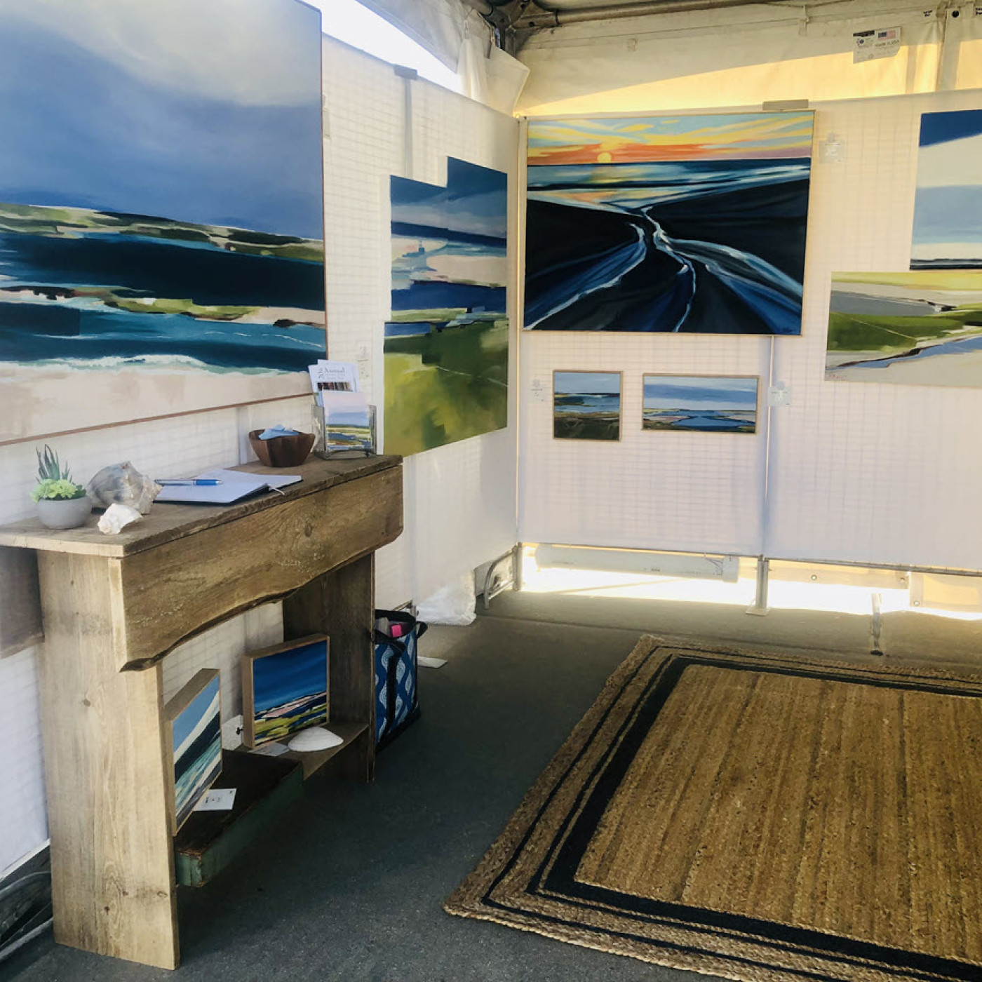
A rug, small table, and vase of fresh flowers are examples of how Kate Fitzpatrick makes her booth an inviting one when she exhibits at art shows.
“It’s like I’m bringing them into my home or my store,” said Fitzpatrick, whose medium is oil painting. “I usually sit outside and across from the booth, so I am accessible to customers. If that isn’t possible, I utilize an open space in the back by eliminating one panel.”

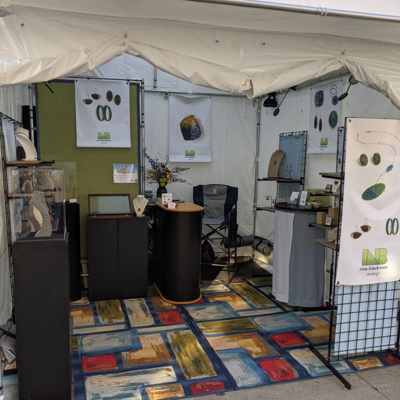
Nisa Blackmon likes to put her chair and sales counter in a back corner of her 10x10 booth, with gridwalls and shelves lining the rest of the walls. “I use a 3-foot French wall to create a space that hides all storage/transportation boxes, etc.,” she said. “I put the sales counter beside this, extending out in the booth, and I sit on the other side of it. In this arrangement, I can see the entire booth, as well as what patrons are looking at, and I can tell when they might have questions about something.”
The jewelry maker uses banners with large, colorful images of her work — both inside and outside the booth. “I also have cloth panels (soft colors) and a colorful rug in the booth that complement (but do not detract from) the colors of my work,” Blackmon said. “Lastly, I always have a striking, fresh flower arrangement in the booth, again with colors complementary to the work and the rest of the booth. People frequently comment on it, and I always recommend the florist to them if I had it done locally.”
She prefers a boutique style of furniture and display for her jewelry rather than cases with the work under glass and less accessible. “I make sure that all pieces of work have their own ‘space’ and are easily visible on neutrally colored necklace forms or individual, cleanly styled display racks, or grouped on boards,” Blackmon said. “I attach the jewelry to their display forms for security whenever possible and haven’t had any problems with theft yet.”
Her advice to other jewelry artists is to “make sure you have several small mirrors around the booth, hung or placed at different heights for different sizes of people.”
Design Shapes for Booths
Beth Knox, of Sun Mountain Bath Company, believes an L-shaped booth works best to interact with attendees. She draws people to her booth with a colorful display, samples, testers, anything hands-on, and by engaging potential customers.
Brian Reagan’s medium is U.S. patent wall art. “I think the best arrangement is to arrange four spaces in a large square that gives each artist two open sides. Everyone that I know in this business would appreciate two open sides without an additional charge for a corner position.”
Photographer Jim Bowers likes an open side or space between his booth and the next one. “It allows for a free flow of people in and out of my booth and to the next,” he said.
Glass artist Jennifer Beaudoin Moffitt said if people like what they see, a U shape works well. “It draws them in when they’re interested enough to talk or examine,” she said.
Susan Williams thinks a rectangle shape with one long side in the front works best. It allows for more open display and makes it easy for customers to see the work. “Make sure that your most eye-catching wares are on the end caps of your booth at waist to eye level,” she said.
Her mediums are pottery and oil painting, and Williams said artists should keep their shelves full because no one wants to buy the last item — even if it is the artist’s best work.
For glass bead mosaic artist Sabrina Frey, a double booth has proven to be most effective. “Many people want to see the art in the 10x10, crowded booths but avoid them because they feel crammed in,” she said.
Jewelry artist Penelope Diamanti likes L or U designs with space between at least one of the tables and the wall, so she can face customers from the other side of the table without blocking them from her work. This also allows for easier access from the back to what is stored under the table.
Photographer S. Brian Berkun said the U-shaped display in his 10x10 booth gives visitors enough space to view his work without crowding others out. “When I have the opportunity for a corner booth, I go with two full ‘legs’ on intersecting walls and a ‘T’ in the front corner,” he said. “It allows people to flow through my booth and increases airflow as well.”
Karen Reece, a glass artist, likes long, narrow designs. “I display on walls only, so I have added PVC corners to ‘round’ the space. It’s working,” she said.
Michelle Arsenault has a modified L or U shape for her booth design. “But if you can give yourself some space behind to work, start your setup forward of the booth,” said the fine silver artist. “It helps to dispel a ‘cave’ that customers will not want to walk in to.”
