How Plato Can Improve Your Photos The Philosophy of Composition
While both light and composition are key to successful photographic images, light is written about more often. Therefore, let’s focus on how to use composition to create stronger photographs.
Composition is the way individual elements are organized to create a unified presentation. In music, for example, by using a limited number of notes, composers from Bach to the Beatles have created a wide range of material.
Photographic composition is about the organization of elements in a picture — that is, how the subject, its shape and color, the lighting, and dark and light areas in the picture frame are arranged in relation to each other. The goal is to use specific compositional forms to create an image that will catch the viewer’s eye, lead it through the image, and keep it within the image as long as possible for maximum impact.
The idea that there are particular formal compositional structures in art goes back at least 2,400 years ago to Plato’s Theory of Ideal Forms. Plato thought these ideal forms were abstract, unchanging, and pleasing to the eye.
Over the centuries, the masters of classic art — painters, sculptors, and architects — refined and redefined these “rules” to create what we have today as “rules” of composition. Now we know these ideal forms have their origins in human psychology and the way the brain brings order and sense to a very chaotic world.
But unlike painters, photographers are limited in their ability to compose images because they must use what is in front of the lens rather than pulling things out of their imagination. With all this in mind, here are a few basic rules or guidelines for composition that will improve photos of your artwork.
To begin, let me point out that in most Western cultures, people read from left to right, so their eyes are trained to enter a page or a photo from the left side. The compositional tools being described all assume this left-to-right habit and build on it.
The Center Is Dead
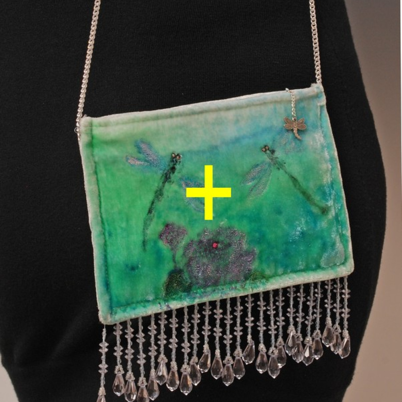
I believe the most static part of a photograph is its center — what I call the dead center. Putting subjects in the dead center of the frame is the antithesis of a well-composed image.
However, lots of people do just this, and every day, I see too many photos where the crafts and artwork are framed right there in the dull middle. People do not know any better, and I think they often take the markings in the center of an LCD screen to mean this is where to put the focus.
This is simply wrong, and it ruins a lot of otherwise decent photos. The center markings usually refer to the areas the camera or phone is measuring for exposure and have nothing to do with composition. The first rule of composition, then, is to always avoid putting anything in the dead center of the frame. Avoid it like the plague.
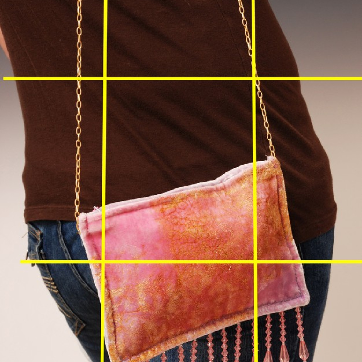
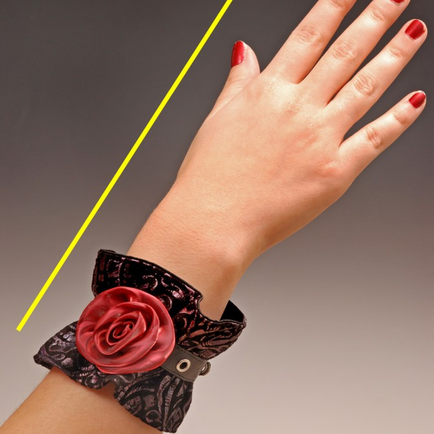
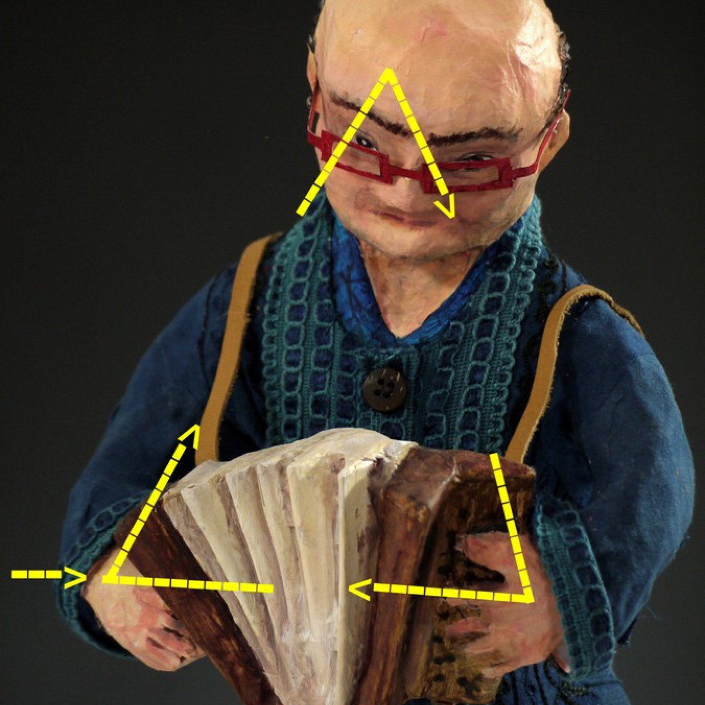
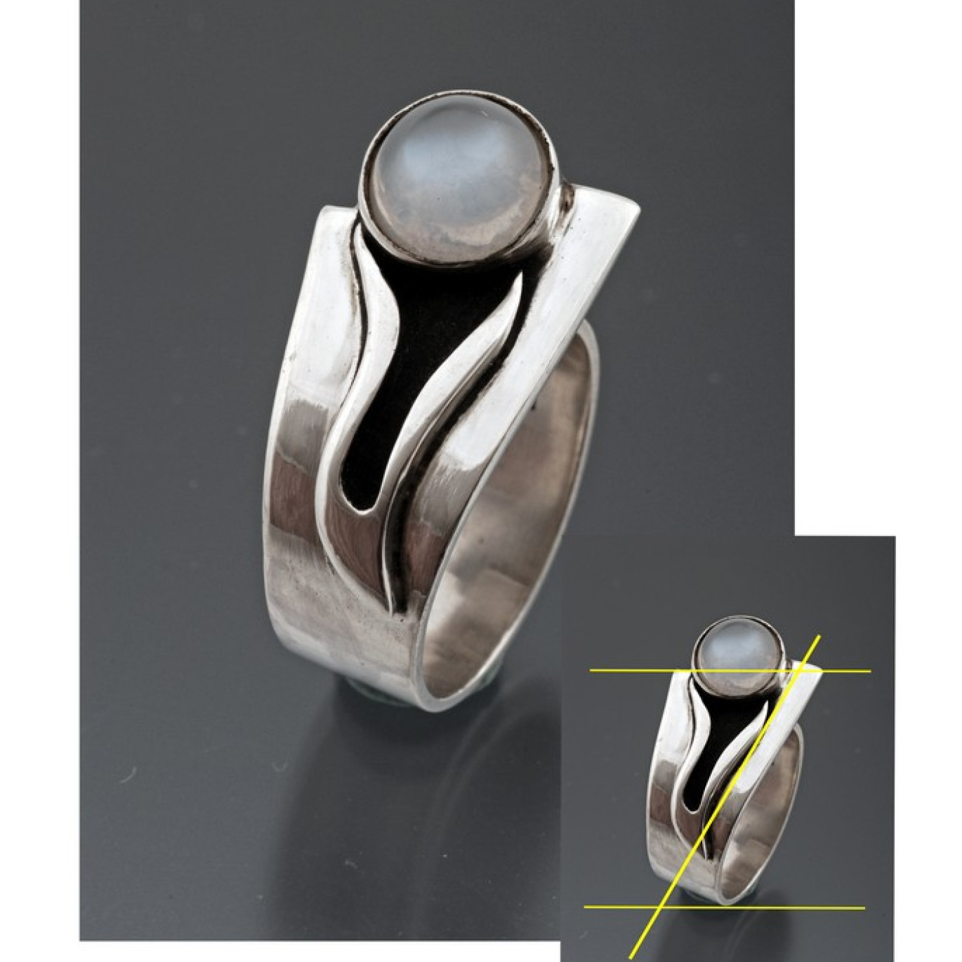
Note: To help understand compositional form, I have added yellow lines and arrows to the photos.
Photos courtesy of Steve Meltzer
The Power of Thirds
The “rule of thirds” is one of the most basic of all compositional forms and the easiest to use. The rule of thirds is made up of four imaginary lines that roughly divide the frame vertically and horizontally into thirds.
Your camera or phone’s LCD screen when set to “grid” will display these lines so you can use them as a guide when you shoot pictures. You get the gridlines by going into the phone or camera menu or Setting pages, clicking on Display, and selecting Grid or Gridlines. While these lines appear on your LCD screen, they do not appear in the pictures.
There are two important concepts that make up the rule of thirds. The first is that objects placed on or along these lines will be seen as visually strong in the frame. Secondly, the strongest visual point in a frame is at the intersection of two grid lines.
In the photo of the turquoise purse, its placement in the dead center of the frame makes the photo flat. In contrast to that is the image of the orange purse. Here, the purse is situated on the lower-third line and between the two vertical lines. This is a strong placement that makes the photo more interesting. It shows the purse and tells us something about the long chain and how the purse is meant to be carried slung low.
Dissecting With Diagonal Lines
A diagonal line through a frame is another active and strong compositional form. Placing objects along the diagonal gives the image a lot of energy and movement.
Look at the photo of the red and black wristband. Notice how the diagonal placement of the arm gives energy to the photo by leading the eye up from the bottom left of the frame to the right-hand top corner. If the hand were lying flat in the frame, the photo would have none of this motion.
Using Triangles To Tame the Eye
Another compositional form is the triangle. By aligning the elements of the image around the three points of a triangle, the eye is led around the subject but the eye stays within the frame.
For an illustration, I used a photograph of a papier-mâché sculpture by my friend, artist Slystone. Following the yellow arrows, you see the path the eye takes around the image.
Entering the frame from the left, it goes to the hand on the left side of the accordion, up to the face, and down to the other hand. Then the eye goes back to the first hand and around and around. Keeping the eye within the frame makes an exceptionally strong image and gives it a sense of wholeness.
Turning the triangle upside down — that is, standing on a point — you have the basic composition for a necklace, with a pendant at its lower tip and the neck chain spread open and following the sides of the triangle.

Combining Forms
The photo of the silver ring illustrates another rule of composition — combining forms. In the small insert photo, I added yellow arrows to show how I composed this shot.
You can see the ring is sitting on the lower-third line, and the upper-third line goes right through the center of the stone. To show the viewer some of the inside of the band, I had to turn the ring to an angle, which aligned it along the diagonal.
When you are using any of these compositional forms, understand that if you are not precisely on these lines, it is OK. You can always fine-tune the photograph later in a photo editor. For now, take some time to practice using these so-called ideal forms and see for yourself how they can improve the photographic images of your work.
About the Author
Steve Meltzer is a writer and photographer currently roughing it in the south of France. His photographic journey began 50 years ago when he had the good fortune to attend workshops and study with photographers such as Cornell Capa, Duane Michals, and Oliver Gagliani. Meltzer has written three books on the photography of crafts and arts and hundreds of articles for publications as diverse as The Seattle Times, Popular Photography, and Natural History. Steve’s business clients have included Bank of America, Starbucks, Helly Hansen sportswear, and the Boeing company. He can be reached at stevefotos@cs.com.
