Build Your Booth - Artists Share Display Tips
The more years artists exhibit at art shows, the more experienced they become setting up their booths and making the most of their space.
“When I first started, I set my booth in a ‘U’ shape, using my tables within the 10-foot space I rented. Over the past few years, I’ve opted for a larger booth (20 feet) instead of the 10-foot space, so that I could display my items all at the front of the booth,” said John McCann, a mixed media artist who lives in Massachusetts.
At some events, McCann places two, 6-foot tables at the front of the booth and has tables around the inside. “This would allow for over 40 feet of table space while having 12 feet displayed (most popular items) close to the aisle,” he said.
Having a large booth allows for more display options, he said. “The added cost of the larger booth also pays for itself with a cleaner booth, better displays, and storage,” McCann said.
While a larger booth space costs more, Jen Tubbin of Second Nature by Hand recommends going that route for an additional reason. She said it creates room for more than one person to be in the booth at a time.
“You need to have enough room for customers to move freely and allow for a few people at a time to comfortably shop your booth,” Tubbin said. “Having multiple people in your booth creates a buying energy that others notice as they walk by.”
Patrice Lewis has a woodcraft business with her husband. She recommends designing booths so they appear airy and open, while also bringing products forward. “The less distance your customer has to travel into your booth, the better,” she said.
Create a professional booth display, Tubbin said. A booth made from reclaimed timbers and handmade flooring produces more sales than a booth made from apple crates, she said. “When your booth presence shows that you mean business, you will do more business,” Tubbin said.
How to Attract Attention
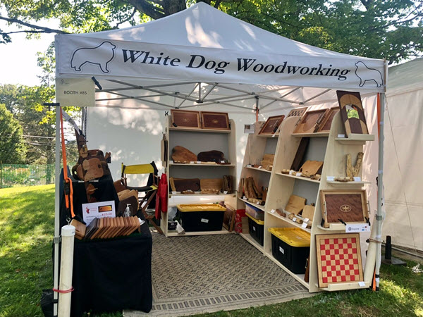
Pennsylvania wood artist Tim Bacon shared one way to get attendees into a booth at an art fair. “Use the end cap to grab customers into the booth,” he said. “We built a set of shelves for display and added shelves on the outer edge to catch attention as people walk by. Works like a charm.”
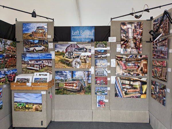
Kyle Wilson, a photographer in North Carolina, places his print bins toward the back of his booth to draw more people into the space. “Also, I lay out my photography by cohesive theme wherever possible. I find that large, clear price signs are important,” he said. “I also want potential buyers to know that more sizes are available — more than what I have on display.”
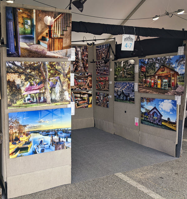
He typically has nine to 10 ProPanels set up for displaying his work. “I use nine panels if there is room in the back of my booth for my chair and a little backstock,” Wilson said. “I will use 10 panels if not and then place my chair out in front of my booth. I always have a ‘French Door’ of one panel featuring my ‘best sellers’ facing forward.”
Wilson also makes sure there is plenty of space inside his booth for wheelchairs, scooters, and for people who may be mobility-challenged.


Ways to Display Art
Peggy Quinn, a ceramicist in Pennsylvania, uses origami folding shelves to display her work.
McCann said that in addition to tables, he uses a grid wall, a riser, and mannequins to showcase his artwork.
Three folding tables, a charcuterie rack, and a knife rack display are found in JoAnn VanDeCarr’s booth. The wood artist lives in New York.
She provided some display tips for other artists. “I bring stock in 18-inch-high Rubbermaid boxes. I stack empties three high and fill them with the packing supplies. I put the two stacks side by side, top them with a piece of thin plywood (36" x 26") and a tablecloth. (Ply takes up no van space),” VanDeCarr said. “This ‘display table’ is also easy to stash under a real table if stock gets low and has the real advantage of having my boxes in the booth at breakdown.”
Lewis said tables should have skirts hanging to the ground, and displays should be kept full but not crammed. “Consider grouping different products so a healthy representation is visible,” Lewis said.
Visibility is the key ingredient, she said. “Consider the power of a vertical display,” Lewis said. “Items displayed where the eye can sweep over them at a glance — and see the entire selection — are far more likely to result in higher sales.”
She also said it is important to keep booth shelves full by restocking them immediately after selling a piece. Artists who run out of replacement stock should either reduce the number of display units or have something on hand to act as a filler for empty displays, Lewis said.
Tubbin said the prime selling space is in the shoulder to knee zone. “Do not place your items on the floor and expect that people will bend over to pick up the product or check pricing,” she said. “People do not want to bend over.”
Lighting and Other Tips
Susan Cole, a Florida jewelry artist, shared details about the Hampton Bay string lights she uses in her booth display. “Mine are waterproof, shatterproof, and LED. Bright white works best for outdoor displays. The type I use requires more battery power than I would have anticipated,” she said. “I had to switch to rechargeable lithium marine batteries for those locations that do not supply free electricity. The batteries are expensive, but work for the duration of a weekend show. I suspend them from the circumference of the upper horizontal tent poles using metal shower curtain hooks.”
Artists provided a few more tips for creating professional, inviting spaces at art shows.
Wilson said he does not want his backstock to look like a yard sale and advises his fellow artists to hide their backstock, coolers, and personal items. “I try my best to present a ‘little art gallery’ at my shows, so I use carpeting whenever possible,” he said.
Create an open feel in the space by limiting clutter, McCann said. “Each show presents its own display issues, depending on the location within the show, exterior weather (outdoor shows), and sometimes your neighbors,” he said.
Vermont printmaker Daryl Storrs believes that in some cases, less is more. “I just think a common mistake is to overload the booth with too much 2-D artworks (if it is a painter, printmaker, photographer). Give pieces room to breathe, and don’t put things on the floor,” he said.
