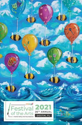
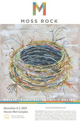
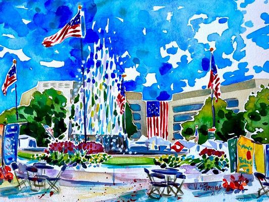
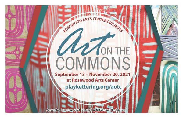
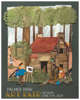
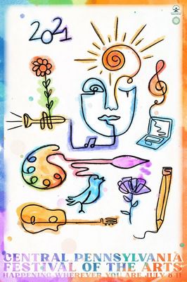
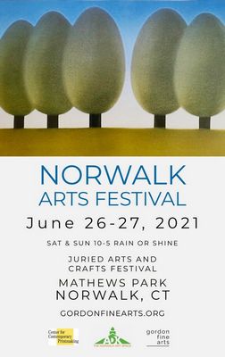
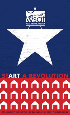
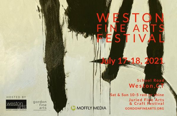
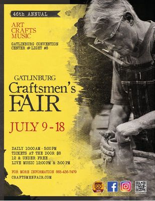
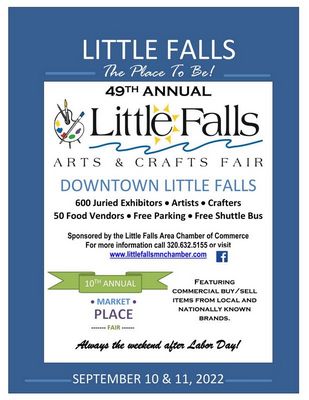
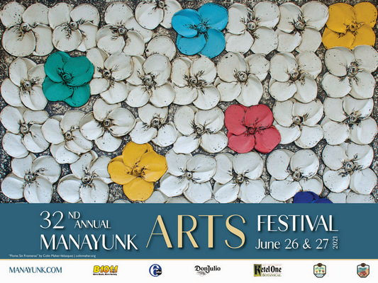
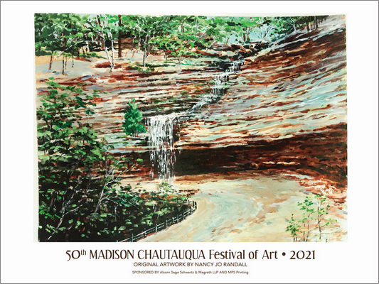
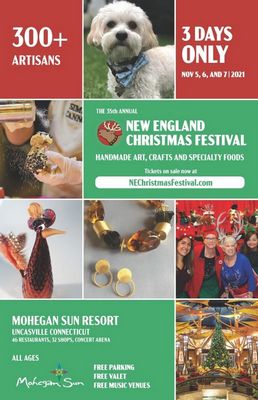
26th Annual Show Poster Contest
There were 58 entries in Sunshine Artist’s annual Show Poster Contest — almost double the number in last year’s competition after many 2020 events were canceled because of the COVID-19 pandemic.
Some promoters decided to have the artists who created their 2020 posters design their 2021 ones as well. One artist tweaked her 2020 design to incorporate a mask into that show’s poster for last year.
This was the first year Sunshine Artist had a digital-only submission process for the poster contest. It went smoothly thanks to Samantha Hoyord, our digital marketing manager.
The judges for this year’s contest were Dort De Wild, Brad Foster, Diane Sulg, and Colleen Zietlow. They ranked each poster from one to 10, with 10 being the best and one being the least in each category.
Foster and Sulg were also judges a year ago and commented on what they thought as they reviewed the submissions in this year’s contest.
“I was pleased to see how many posters there were to go through — a sign of the return of art festivals working to survive all over the country. It was interesting how some of them also specifically made sure to address the pandemic changes for the year in their posters, while still putting on a show and hoped that they would make it through these bad times and be back again next year,” Foster said.
Sulg said judging the entries in this year’s contest was both challenging and fun. She said it was challenging because there were so many excellent posters and fun because they used great graphics, outstanding typography, and attractive color palettes. “You all made me want to travel the country and attend every event,” Sulg said. “Congratulations on a job well done!”
Enjoy reading about the artists and designers behind this year’s winning images. Show promoters and organizers are invited to submit their 2022 posters and artist bios for next year’s contest throughout the year at sunshineartist.com/poster-contest.
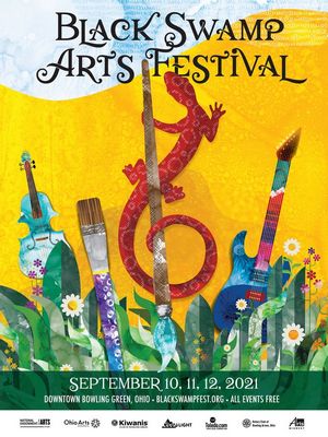
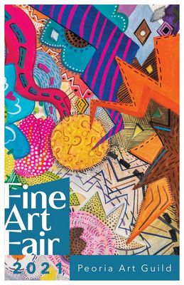
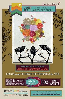
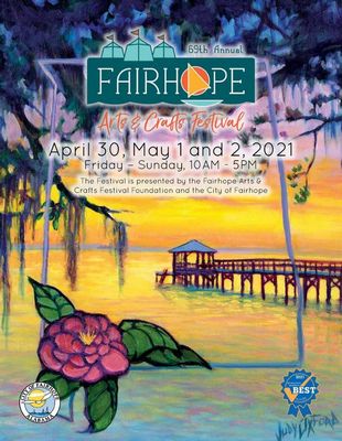
OVERALL BEST

Black Swamp Arts Festival
Promoter: Black Swamp Arts Festival
Bowling Green, Ohio, September
Amy Karlovec designed the Overall Best winner. The senior graphic designer at Bowling Green State University since 2017, she has designed many Black Swamp Arts Festival posters. ”I wanted to come up with a design that when seen, would make people feel alive, energized, and excited for the upcoming festival after a year hiatus,” she said.
The image incorporates the original alcohol ink artwork of her two daughters and mother-in-law. “From the dancing blades of grass to the bright yellow background and blue clouds, to the iconic graphics of the festival — this year’s poster was a family collaboration,” Karlovec said.
The judges liked many things about Karlovec’s poster design. Dort De Wild said it had a clean layout with fun, bright imagery. Diane Sulg described it as fun with a great use of color.
Brad Foster thought the poster had a great font for the show. Colleen Zietlow said, “I like the texture at the bottom and the simplicity of the yellow and blue at the top.”
OVERALL BEST Runner‑Up
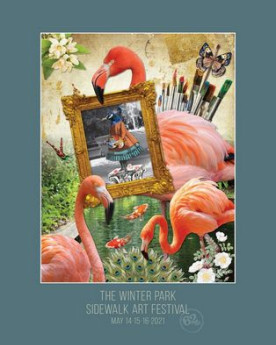
The Winter Park Sidewalk Art Festival
Promoter: The Winter Park Sidewalk Art Festival
Winter Park, Florida, March
Alice Moulton said the festival’s 2020 poster and its artist never received the attention they deserved due to the last-minute cancellation of that year’s festival. “So, the festival invited the same poster artist, Victor Bokas, back to create a companion poster for 2021,” she said. “Both posters are created in Victor’s fun, colorful, whimsical style, and are full of surreal images.”
His 2021 poster features a flamingo that has just bought a painting of the Peacock Lady, standing on a Greek column holding an artist’s palette. Moulton said iconic Winter Park elements can be seen throughout this mixed media collage. It is made up of 25 images and includes a canal, orange blossoms, and a koi fishpond. Bokas promises that “the more you look, the more you will find.”
The judges liked this poster. De Wild described it as an “interesting, collaged image.” Sulg found it to be a “lush and lovely poster.”
Zietlow said the poster had fun images, strong composition, and good contrast throughout it. Foster said the image is eye-catching with the gray border setting it off.
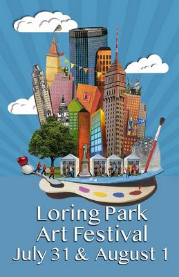
BEST LAYOUT
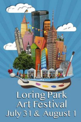
Loring Park Art Festival
Promoter: Artists for Artists
Minneapolis, Minnesota, July
Pat Parnow is the artist behind this poster design. Parnow participated in art fairs in the Midwest for 34 years with photography. She retired from doing shows a few years ago and now uses the experience of those 34 years to be the director of the Loring Park Art Festival.
To keep her artistic mind in shape, Parnow makes assemblies like the 2021 poster by watching for odd bits and pieces to photograph, collecting separate interesting images, and then combining them to make a detailed piece using Photoshop.
She likes hiding things, so people do not see everything at their first glance. “It’s very satisfying to assemble a piece like this that depicts an unreal place for a real event,” Parnow said.
The judges liked Parnow’s graphic elements. “Strong composition. Love the white accents with clouds to tie in with the lettering,” Zietlow said. “It makes for a cohesive piece of work. One of my favorites.”
Foster said the image of the city and show elements is wonderful. De Wild described the poster design as having explosive imagery with simple text, and Sulg said it is a great graphic.
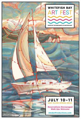
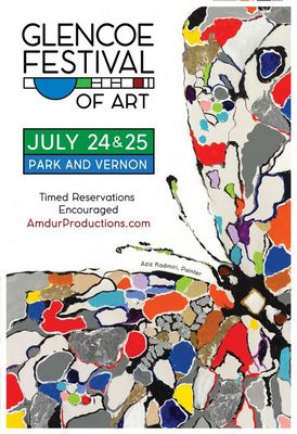
ARTISTIC MERIT
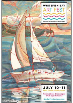
Whitefish Bay Art Fest
Promoter: Amdur Productions
Whitefish Bay, Wisconsin, July
Dan Wiemer created this image. “I combine acrylic and watercolor to create stylized landscapes,” he said. Through a resist process that he builds with negative shapes, he creates paintings that resemble woodcuts and batiks.
A graduate of Iowa State University, Wiemer is trained as a graphic designer. He likes to play with the shapes and textures of the landscape.
“I try to find rhythms in the scene that translate into exciting motifs. I don’t try to replicate nature,” Wiemer said. “I try to distill, stylize, and give the viewer my interpretation, something they can be a part of.”
Currently a fine artist, illustrator, and workshop instructor, he spent three weeks painting and teaching in China through an artist exchange program. “I feel I am only beginning to explore,” Wiemer said.
For him, the process is the product. Wiemer wants it to reflect an energy and directness. “My work is a reflection and response of my love of the natural world,” he said.
Wiemer considers himself a landscape artist. Most of his work is created in water media. He paints both on location (plein air) and in the studio.
“I utilize the opaque nature of acrylic and the transparent qualities of watercolor to create contrasts,” he said. “As a past president of the Minnesota Watercolor Society, I see firsthand the endless variety of ways to handle water media, and this excites me.”
Sulg said his artwork is fitting for the Whitefish Bay Art Fest. “Great poster!” she said. De Wild also thought it was a great image.
Zietlow said it has a freshness that gives the poster energy. The boxes the information is in balance beautifully with the direction of the sails of the boat, she said. “I love a lot about this piece,” Zietlow said.
ORIGINALITY (TIE)
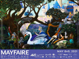
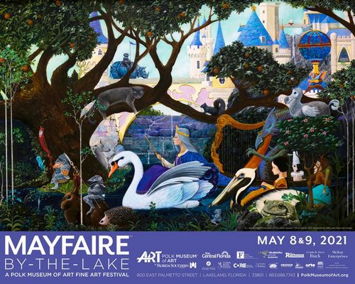
Mayfaire-by-the-Lake
Promoter: Polk Museum of Art
Lakeland, Florida, May
Like a long-forgotten fairy tale, the Swan Queen floats down a favorite brook in celebration of the end of a long period of castle confinement. Her entourage includes her lady in waiting, court painter, court jester, royal idea pilot, various knights, and the court musician.
The creatures of the forest have come out to observe and possibly join the spectacle, grateful to be with those they have not been able to see for a very long time. Not everyone gets to enjoy the procession. A knight dutifully guards the castle, and Humpty Dumpty cannot bring himself to leave the castle.
“Procession of the Swan Queen” was designed by artist R.L. Alexander. He finds inspiration in the everyday and the distant past, from tales told through the ages, to stories waiting for discovery.
Alexander goes through life with his sketchbook at the ready, recording thoughts, images, and ideas as they present themselves. From his sketches, his paintings spring to life through his meticulous technique. He is a compulsive draftsman who paints primarily on wood panels using only the finest oil colors with techniques passed down through the ages.
His paintings reside in private and public collections throughout the United States, Japan, and Europe. His work is intended to be both thought provoking and whimsical, evoking quirky delight in those who value imagination and craftsmanship.
For his part, Alexander hopes his paintings are approachable yet mysterious, rewarding for those who take the time to look — and think — a little deeper. He spends most of his time with his head in the clouds, but occasionally you can find him at home in Celebration, Florida, with his wife Becky, son Niko, and Italian Greyhounds Beppo and Botticelli, who sneak their way into many of his paintings.
De Wild said Alexander’s imagery is great for this event, and Sulg described it as magical. Foster said it was a “wonderfully intriguing image,” and Zietlow loved the painting featured in it.
The Winter Park Sidewalk Art Festival
Promoter: The Winter Park Sidewalk Art Festival
Winter Park, Florida, March
The runner-up in the Overall Best category, this poster was designed by Victor Bokas. He also designed the festival’s 2020 poster, which never received attention after that year’s event was canceled at the last minute.
Alice Moulton said the festival invited Bokas back to create a companion poster for the 2021 festival. She said both posters were created in his fun, colorful, whimsical style, and are full of surreal images.
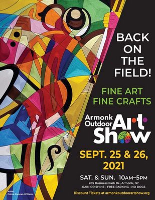
COLOR
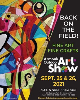
Armonk Outdoor Art Show
Promoter: Friends of the North Castle Public Library, Inc.
Armonk, New York, September
The 2021 Armonk Outdoor Art Show poster was designed by Art Director Susan Goldstein, with featured artwork by Prince Duncan-Williams. Goldstein has worked for the art show since 2004 and is responsible for its advertising and public relations, including printed and digital material.
Few musical styles are as colorful as jazz, and Duncan-Williams knows this. Composed of silk as smooth as the music of John Coltrane and with an explosive vivacity of colorful silk threads that suggest the frenzied syncopation of New Orleans-style jazz, his silk mosaics succeed in creating something of a miracle: jazz without sound.
He was born in Ghana in West Africa into a family tradition of working with silk thread art that was nearly four generations in the making. These silk threads are the same threads that are used to make Royal Kente, the cloth famously used for royal clothing for the Akan people.
Foster said the poster has an excellent balance of artwork to type, with the artist managing to work in lots of information in a non-cluttered way. De Wild said it is colorful and easy to read.
Zietlow said the abstracted figure on the left of the diagonal balances well with the information displayed on the right. Sulg said, “Excellent color and poster!”
INVITING/READABLE
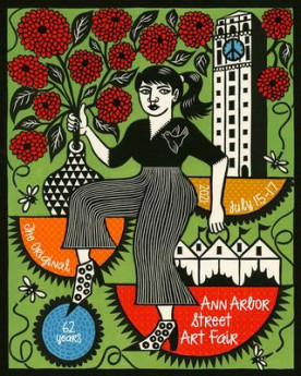
Ann Arbor Street Art Fair, the Original
Promoter: Ann Arbor Street Art Fair, Inc.
Ann Arbor, Michigan, July
The Original Ann Arbor Street Art Fair’s posters are commissioned pieces created specifically for their poster artwork. They must contain an image of the University of Michigan’s historic Burton Bell Tower — whether representational or abstract.
Betsy Best created the 2021 poster. She is a printmaker who works exclusively with linoleum and wood. Before her printmaking studies at Cornish College of the Arts in Seattle, Washington, she earned a degree in graphic arts from Ferris State University, in Big Rapids, Michigan.
Best attended a printmaking residency in Japan, studying woodblock printmaking with master craftsmen, with further printmaking studies in Florence, Italy. These opportunities are significant to her art practice.
She is enchanted by the printmaking process, as well as the idea that the creation of multiples has the potential to make art accessible to all. With a predominance of pattern and color, Best creates playful, ambiguous images using stylized figures and a disparate visual vocabulary.
Her work has been featured in both solo and group exhibitions and is included in the city of Seattle art collection. She was the recipient of an Artist Trust/Washington State Arts Commission Fellowship Award and received two Willapa Bay AIR Residencies in Oysterville, Washington. Best currently resides in Flushing, Michigan.
“Excellent poster for a college town,” Sulg said. De Wild described Best’s work as “bold,” with good color integration. Foster said it has a strong, eye-catching image, and Zietlow found all the design elements to be well balanced, creating a strong composition.
HONORABLE MENTIONS
Loring Park Art Festival
Promoter: Artists for Artists
Minneapolis, Minnesota, July
Pat Parnow’s poster was the winner in the Best Layout category and received an honorable mention in the 2021 Overall Best category.
She participated in Midwest art fairs for 34 years with photography. A few years ago, she retired from doing shows and now uses her decades of experience as the director of the Loring Park Art Festival.
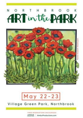
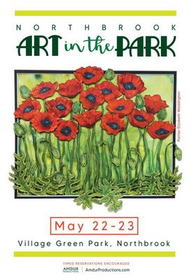
Northbrook Art in the Park
Promoter: Amdur Productions
Northbrook, Illinois, May
The poster for this runner-up in the Overall Best category is the work of Elizabeth Waddington. “I collage my watercolor florals to capture the exuberance and color of the garden,” she said.
She said flowers are the perfect vehicle for color, form, and composition. “I paint two or more paintings at the same time so I can collage my flowers together,” Waddington said. “My arrangements frequently go outside the mat to give the appearance that my flowers are bursting out of their space to gain your attention.”
Foster described this poster as an “elegantly clean, formal design, with a good balance of colors, information.” Sulg thought it had lovely color and composition. De Wild said the image attracts interest, and Zietlow said it is a “nicely done piece of work.”
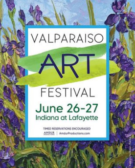
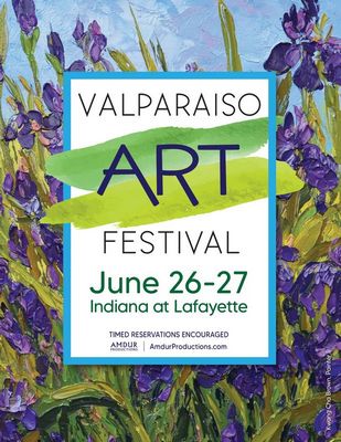
Valparaiso Art Festival
Promoter: Amdur Productions
Valparaiso, Indiana, June
Kwang Cha Brown designed this poster, and it was a runner-up in the 2021 Overall Best category. “My impasto, impressionistic oil paintings are vibrant and joyful, using palette knife strokes to create a 3-D effect,” she said. “These thick layers of color jump at you from every angle, bursting with energy.
Brown completed her Master of Fine Arts in painting at Indiana State University and attended Indiana University in Bloomington’s MFA program for its printmaking class.
After receiving her Bachelor of Fine Arts from the Herron School of Art, where she majored in painting and minored in drawing, Brown attended the Pont-Aven School in Pont-Aven, France, as well as Hunan Normal University for Art, in Changsha, China.
She taught figure drawing at the Herron School of Art and oil painting at the John Waldron Arts Center. Brown was a drawing and painting instructor at Indiana State University for two years.
“Travel is as much a part of my lifestyle as my love for painting. Greece, Portugal, Spain, Japan, Italy, France, England, Holland, Korea, and Beijing are some of my favorite travel destinations,” she said. “Additionally, I have exhibited in various places around the world, such as Greece, Portugal, Spain, Italy, France, South Korea, and throughout America.”
Sulg thought this poster’s layout was excellent. De Wild said it was color coordinated, with a nice border, and Zietlow said the poster had good composition, a nice contrast in textures and colors, and was easy to read.
Click images below to view all entries